Products & Solutions
Absolute's products and solutions empower businesses with cutting-edge security and resilience tools. Here, you’ll find blog posts packed with expert insights on Absolute’s technology and capabilities.
Most recent
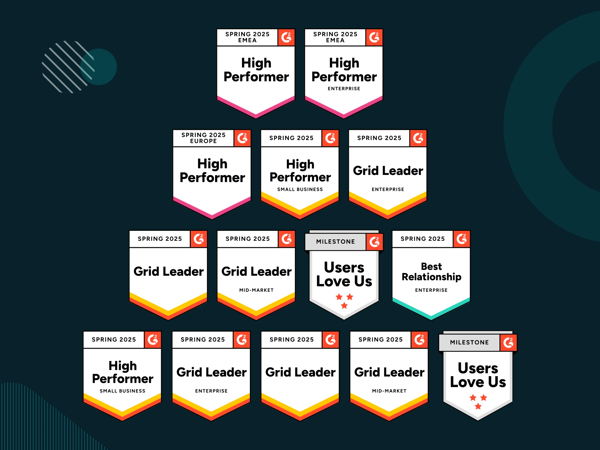
Bolster Your IT and Security Resilience with Absolute Security’s Leadership Solutions
In today’s unpredictable security landscape, resilience is key. See why Absolute Security’s G2 Spring 2025 recognition in Endpoint Management and Zero Trust Networking matters for organizations ready to adapt, respond, and thrive in the face of disruption.
Published
May 28, 2025
Updated

Explore our Blog Library
Oops! Something went wrong while submitting the form.
Filtering by:
Text
No results found.
There are no results with this criteria. Try changing your search.
Bolster Your IT and Security Resilience with Absolute Security’s Leadership Solutions
Products & Solutions
Bolster Your IT and Security Resilience with Absolute Security’s Leadership Solutions
In today’s unpredictable security landscape, resilience is key. See why Absolute Security’s G2 Spring 2025 recognition in Endpoint Management and Zero Trust Networking matters for organizations ready to adapt, respond, and thrive in the face of disruption.
Zero Trust
Endpoint Resilience
Access Resilience
Resilience
IT Asset Management
Empowering MSPs to Boost Enterprise Resilience Across Environments

Products & Solutions
Empowering MSPs to Boost Enterprise Resilience Across Environments
Boost efficiency and endpoint security with Absolute Resilience for ConnectWise. Learn how MSPs can streamline operations and secure customer devices.
Endpoint Resilience
IT Asset Management
Ransomware
Absolute Enhances Zero Trust with Secure Access App Connectors

Products & Solutions
Absolute Enhances Zero Trust with Secure Access App Connectors
Enhancements to Secure Access for fast, end-to-end zero trust connectivity and security to public/private clouds and data centers.
Zero Trust
Application Resilience
Data Protection
Debunking Myths About Secure Access Solutions

Products & Solutions
Debunking Myths About Secure Access Solutions
We’d like to set the record straight with facts about the strengths of our solution and why we’re still the cornerstone technology and trusted choice for over 2,500 Public Safety and First Responder organizations worldwide for over two decades.
Generative AI
Threat Protection
Access Resilience
Resilience
Introducing New Resilience Capabilities to Strengthen Endpoint Cyber Resilience While Reducing Cost and Complexity

Products & Solutions
Introducing New Resilience Capabilities to Strengthen Endpoint Cyber Resilience While Reducing Cost and Complexity
This blog post covers how the new Patch, Remediate, Automate and Rehydrate capabilities empower organizations to boost their cyber resilience through both proactive and remedial measure.
Endpoint Resilience
Resilience
Threat Protection
Application Resilience
Enhancing IT Efficiency and Cyber Resilience Through Automation

Products & Solutions
Enhancing IT Efficiency and Cyber Resilience Through Automation
The Automated Actions capability empowers IT and Security teams to leverage automation as part of their IT and incident response practices to boost efficiency and cyber resilience.
Endpoint Resilience
Application Resilience
Compliance
Going Beyond Traditional SSE

Products & Solutions
Going Beyond Traditional SSE
Absolute Secure Access Enterprise offers resilient SSE, endpoint compliance, and secure access to private apps, websites, and cloud, from a single console.
Resilience
Ransomware
Data Protection
SASE and SSE
Absolute Unwraps AI Threat Insights

Products & Solutions
Absolute Unwraps AI Threat Insights
Get proactive AI alerts on suspicious behavior — Comprehensive alerts on user, device, network, and application behavior to detect issues before they become problems.
Generative AI
Access Resilience
Threat Protection
Shadow IT
Ransomware
Absolute Security Automates Remediation for CrowdStrike and other Windows BSOD Incidents

Products & Solutions
Absolute Security Automates Remediation for CrowdStrike and other Windows BSOD Incidents
On July 19, 2024, CrowdStrike’s update caused a BSOD outage. Absolute Security provided tools to remotely repair affected endpoints and prevent future issues.
Endpoint Resilience
Compliance
Resilience
Applied Resilience with Absolute Secure Endpoint

Products & Solutions
Applied Resilience with Absolute Secure Endpoint
Align cyber resilience goals to real-world threats and implement a strategy to adapt to multiple failure points if endpoint defenses are impaired during an attack.
Endpoint Resilience
Threat Protection
Resilience
Absolute Investigations Device Recovery Success Stories Winter 2024

Products & Solutions
Absolute Investigations Device Recovery Success Stories Winter 2024
When it comes to managing your devices, and more specifically, stolen laptops, Absolute customers have an important resource to lean on. The Absolute Investigations Team.
Data Protection
IT Asset Management
Recover Missing Devices
Absolute Secure Endpoint 8.0 Adding a New Level of Endpoint Resilience

Products & Solutions
Absolute Secure Endpoint 8.0 Adding a New Level of Endpoint Resilience
Absolute Secure Endpoint 8.0 enhances the Absolute Console’s navigation flow, additional Device Usage events, discovering sensitive files across endpoints with greater flexibility, contextual Geo information, and more.
Data Protection
Endpoint Resilience
IT Asset Management
Sorry, no items found...